Behind the interior designer: Maria Del Campo
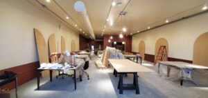
In celebration of the final weeks of staging our Oakland location, we sat down with the Interior Design lead on our team, Maria Del Campo, and asked a few in depth questions on her personal inspiration and the design process behind Groundfloor’s color palettes and unique finishes. Maria is a highly experienced interior designer with a demonstrated working history focused in the hospitality & multifamily design industry. A known food lover and travel junkie, Maria is currently simultaneously handling the interior needs of all Groundfloor locations while earning her masters in Italy.

Where do you draw inspiration from? How would you describe your personal design style? and what is your favorite time period of design?
My inspiration comes from the use of the space, which brings some innovative ideas, as well as connecting with the neighbourhood and the branding of every space. I believe my design style is modern with a touch of classy, timeless details, normally shown in bespoke woodwork pieces and hard finishes that are normally seen in the main outlets like kitchen areas and restrooms to create a wow effect on every user. I like furniture and interiors from every period, as they all have their own way of connecting us to that era. For some spaces, I can be more inspired by ornate styles and others by a minimal touch.
How did you come up with the color palette incorporated into the design for SF and Oakland?
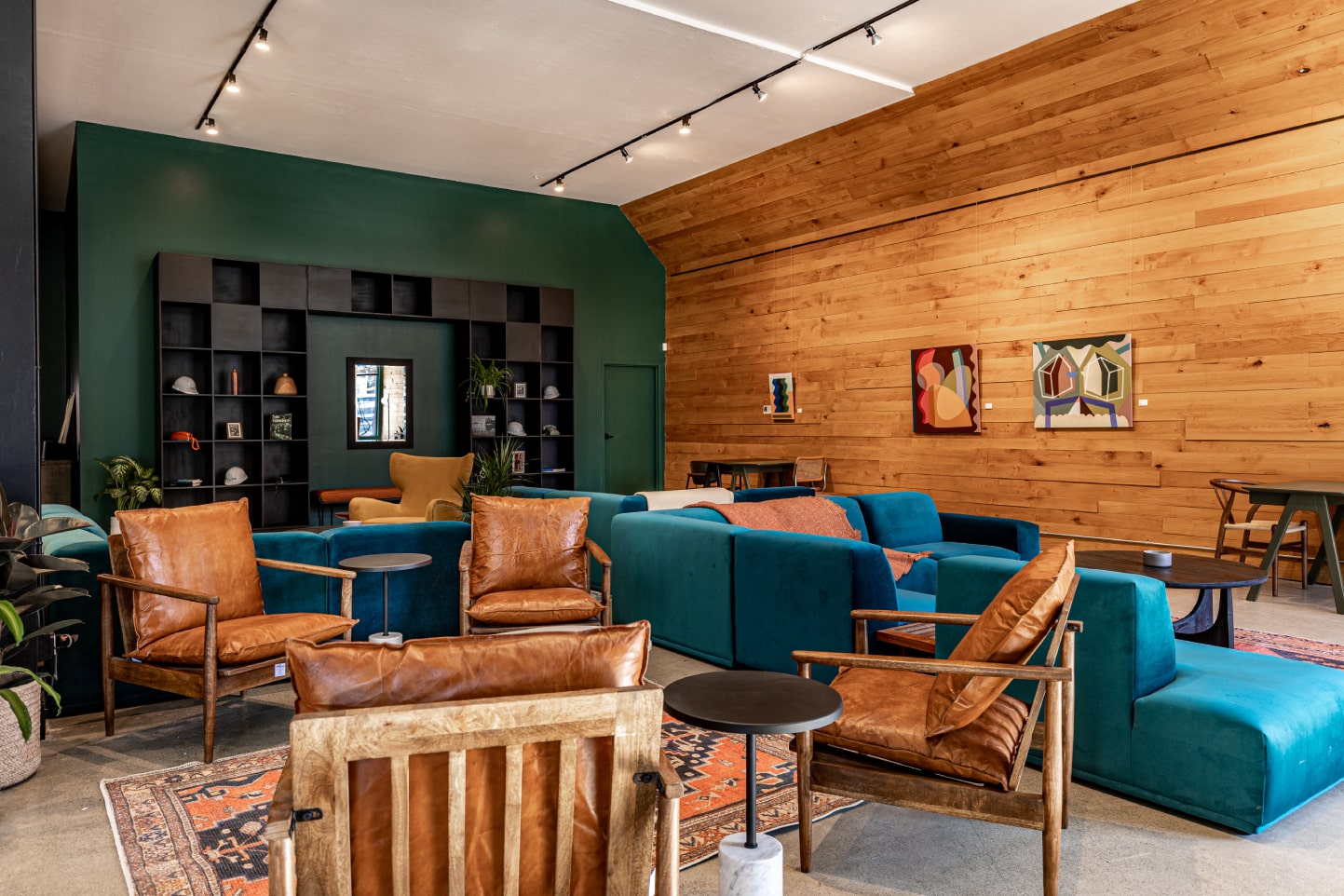
For SF, the color palette inspiration came from the Groundfloor branding, and I added a neighborhood touch to it. Oakland has its own vibe, with some colors similar to San Francisco but with unique, more subtle light green and cabernet touches related to the neighborhood.
The arch is a notable Groundfloor symbol. Have you found it challenging to incorporate the arch into the design of the building? Is this something you see as being a thorough-line for each location?
Ideally, the arch symbol should be noted in every Groundfloor space physically or outlined, as you will soon see in Oakland. It is part of the logo that symbolizes an invitation to enter our spaces.
After designing Valencia St, were there any significant changes you thought to make for Oakland’s location?
Yes, the color palette and most of the finishes are meant to relate to the neighborhood and have their own vibe and uniqueness. Though there are some similar finishes that are Groundfloor symbolic items/colors. We also listened to our members and added certain privacy to the desks and more workable areas.
What is your favorite part of the design process behind Groundfloor?
The best part of designing Groundfloor’s interior is the team collaboration with great energy and enthusiasm that translates into the spaces.
